Traditional Bible layouts—with their double columns and tissue-thin pages—can cause significant visual fatigue. Fortunately, new editions have been developed specifically to address how dyslexic readers process printed text.
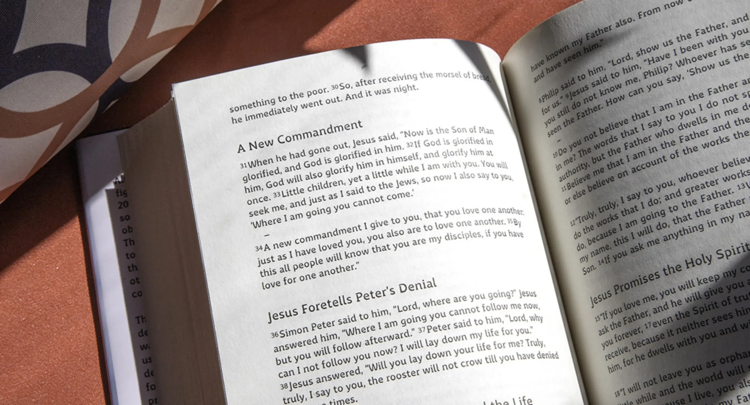
ESV Crystal Edition
1. The ESV Crystal New Testament
This edition represents a major leap forward in accessible academic design.
-
The Translation: Features the English Standard Version text.
-
The Design: Developed in collaboration with researchers from the University of Cambridge, it features a single-column text layout and splits paragraphs that are longer than eight lines to reduce visual fatigue.
-
The Typography: It uses the pioneering Grace font, designed by 2K/Denmark, which weights letters heavily at the bottom to stop them from appearing to float. Similar letters, like ‘m’ and ‘n’, are given unique shapes to help readers tell them apart.
-
The Paper: Printed on opaque, cream-coloured paper to minimise contrast and stop text from showing through the page.
- Bible Information:
– Publisher: Cambridge University Press
– ISBN: 1009742957
– Where to buy? Available on Amazon and Eden

CSB Grace Bible for Dyslexia with Overlays
2. The CSB Grace Bible
This is an excellent option for those wanting a highly readable, complete text for both adults and young readers.
-
The Translation: Uses the Christian Standard Bible text, with editions available for both adults and children.
-
The Layout: Created in partnership with 2K/Denmark and Cambridge University, it features increased spacing between letters, words, lines, and paragraphs.
-
Visual Aids: Includes unique, coloured page overlays created by Cambridge University’s research department to further enhance visual processing and readability.
- Bible Information:
– Publisher: CSB by Holman
– ISBN: 979-8384518242
– Where to buy? Available on Amazon

NIV Clear Focus Bible
3. The NIV Clear Focus Bible
If you prefer the New International Version, this is a fantastic option designed specifically for sustained focus and reading comprehension.
-
The Translation: Available in both the standard NIV and the simplified NIrV (New International Reader’s Version), which is written for a third-grade reading level and is excellent for new readers or children.
-
The Typography: Rather than a specific dyslexia font, it uses a unique “bionic reading” layout. This method bolds key letter clusters at the beginning of words to automatically guide your eyes and boost comprehension.
-
The Design: It is formatted strictly as a reading Bible designed to support sustained reading. It intentionally omits book introductions and study notes to reduce cognitive load and visual clutter.
- Bible Information:
– Publisher: Zondervan
– ISBN: 0310465559
– Where to buy? Available on Amazon
What to Look for When Choosing an Accessible Bible
If you are purchasing a Bible for a church library, a parish pew, or your own study, keep these crucial features in mind:
-
Paper Quality: Look for opaque, cream, or off-white paper. Stark white paper creates too much contrast, and thin “Bible paper” allows text to bleed through, creating visual clutter.
-
Single-Column Layouts: Double columns force the eye to track awkwardly across a narrow space. Single columns support a much more natural reading flow.
-
Bottom-Weighted Fonts: Typefaces designed specifically for visual processing challenges (like the Grace font) help anchor the text visually to the page.


0 Comments